9 Plots for Qualitative Data
This section provides instructions for creating plots for quantitative data. All plots in Rguroo are highly customizable. In addition to the options in the ![]() dialog, you can customize your plots using the options in the
dialog, you can customize your plots using the options in the ![]() dialog.
dialog.
![]()
![]()
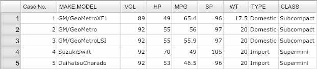
- Use a dataset in your Rguroo account or recreate the example below by importing the cardata dataset from the Rguroo dataset repository called Rguroo Users Guide into your account.
Click here to see a portion of the dataset.
Open the Plots toolbox on the left-hand side of the Rguroo window. Click on the
Create Plotdropdown menu and choose the Barplot function. The Barplot dialog opens (see Figure 9.1).Select your dataset from the Dataset dropdown menu. In this example, we select the cardata.
To create a barplot with categories across the x-axis, open the
Categoricaltab (this is the default tab).Use the Factor 1 dropdown to select the categorical variable for the barplot. If your data is in the form of a frequency or relative frequency table, use the Frequency dropdown to choose your frequency variable.
Click the Preview icon
 to see the barplot.
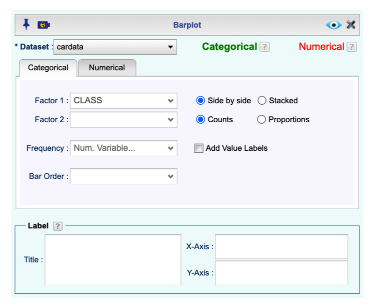
Figure 9.1: Barplot function Dialog
An example of Rguroo barplot output:

Figure 9.2: An example of a barplot output.
Additional Options for Barplots: - You can obtain relative frequency barplots by selecting the option Proportions.
You can add value labels to the bars.
You can use Bar Order to reorder the bars or use the Level Editor
 to reorder the bar in any desired order.
You can create barplots for numerical variables by selecting the
Numericaltab.You can customize the appearance of the barplot using the options in the
 dialog.
![]()
![]()
- Use a dataset in your Rguroo account or recreate the example below by importing the cardata dataset from the Rguroo dataset repository called Rguroo Users Guide into your account.
Click here to see a portion of the dataset.
Open the Plots toolbox on the left-hand side of the Rguroo window. Click on the
Create Plotdropdown menu and choose the Barplot function. The Barplot dialog opens (see Figure 9.3).Select your dataset from the Dataset dropdown menu. In this example, we select the cardata.
To create a Pareto Chart with categories across the x-axis, open the
Categoricaltab (this is the default tab).Use the Factor 1 dropdown to select the categorical variable for the barplot. Use the Frequency dropdown to choose your frequency variable, if your data is in the form of a frequency or relative frequency table.
From the Bar Order dropdown, select Decreasing Value.
Click the Preview icon
to see the Pareto Chart.
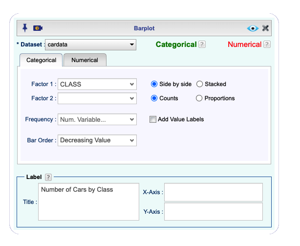
Figure 9.3: Barplot function Dialog to Create a Pareto Chart

Figure 9.4: An example of an Rguroo Pareto chart output.
![]()
![]()
- Use a dataset in your Rguroo account or recreate the example below by importing the cardata dataset from the Rguroo dataset repository called Rguroo Users Guide into your account.
Click here to see a portion of the dataset.
Open the Plots toolbox on the left-hand side of the Rguroo window. Click on the
Create Plotdropdown menu and choose the Barplot function. The Barplot dialog opens (see Figure 9.6).Select your dataset from the Dataset dropdown menu. In this example, we select the cardata.
To create a barplot with categories across the x-axis, click the
Categoricaltab (this is the default tab).Select two categorical variables from the Factor 1 and Factor 2 dropdowns. If your data is in the form of a frequency table, select the frequency variable from the Frequency dropdown.
Select the Stacked option. Adjust the other options appropriately.
Click the Preview icon
to see the stacked barplot.
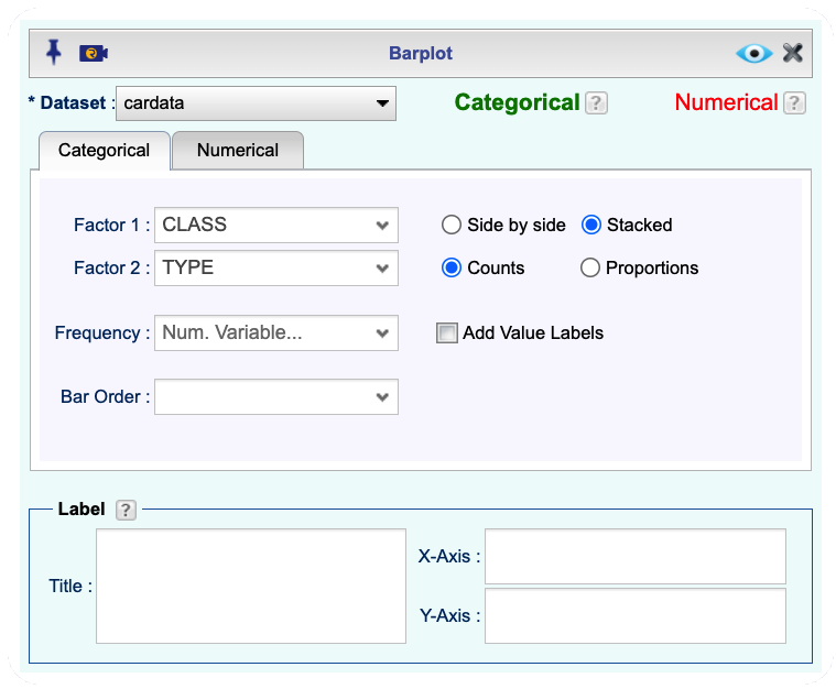
Figure 9.5: Barplot function Dialog to Create a Stacked Barplot
An example of an Rguroo stacked barplot output:

Figure 9.6: An example of a stacked barplot output.
![]()
![]()
- Use a dataset in your Rguroo account or recreate the example below by importing the cardata dataset from the Rguroo dataset repository called Rguroo Users Guide into your account.
Click here to see a portion of the dataset.
Open the Plots toolbox on the left-hand side of the Rguroo window. Click on the
Create Plotdropdown menu and choose the Barplot function.The Barplot dialog opens (see Figure 9.7).Select your dataset from the Dataset dropdown menu. In this example, we select the cardata.
To create a barplot with categories across the x-axis, click the
Categoricaltab (this is the default tab).Select two categorical variables from the Factor 1 and Factor 2 dropdowns. If your data is in the form of a frequency table, select the frequency variable from the Frequency dropdown.
Select the Side by side option. Adjust the other options appropriately.
Click the Preview icon
to see the side-by-side barplot.
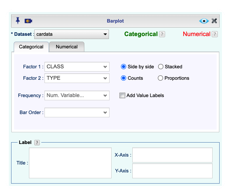
Figure 9.7: Barplot function Dialog to Create a Side-by-Side Barplot

Figure 9.8: An example of an Rguroo side-by-side plot.
![]()
![]()
- Use a dataset in your Rguroo account or recreate the example below by importing the cardata dataset from the Rguroo dataset repository called Rguroo Users Guide into your account.
Click here to see a portion of the dataset.
Open the Plots toolbox on the left-hand side of the Rguroo window. Click on the
Create Plotdropdown menu and choose the Pie Chart function. The Pie Chart dialog opens (see Figure 9.9).Select your dataset from the Dataset dropdown menu. In this example, we select the cardata.
Select a categorical variable from the Factor dropdown. If data are in frequency table format, select the frequency variable from the Frequency dropdown.
(Optional) To order the pie slices from largest to smallest, select Increasing Value in the dropdown Slice Order.
Click the Preview icon
to see the side-by-side barplot.
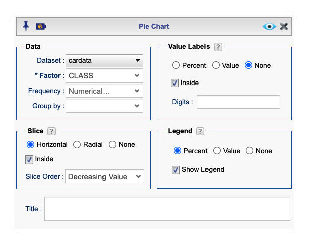
Figure 9.9: Piechart function Dialog

Figure 9.10: An example of a pie chart output.
- Use a dataset in your Rguroo account or recreate the example below by importing the cardata dataset from the Rguroo dataset repository called Rguroo Users Guide into your account.
Click here to see a portion of the dataset.
Open the Analytics toolbox on the left-hand side of the Rguroo window. Click on the
Analysisdropdown menu and choose the Contingency Table function. The Contingency Table dialog opens see Figure @ref(mosaic_GUI).Select your dataset from the Dataset dropdown menu. In this example, we select the cardata.
Select two categorical variables from the Factor 1 and Factor 2 dropdowns. If data are in a frequency table format, select the frequency variable from the Frequency dropdown.
Select the Mosaic Plot option.
Select the checkbox Mosaic Plot.
Click the Preview icon
to see the mosaic plot.
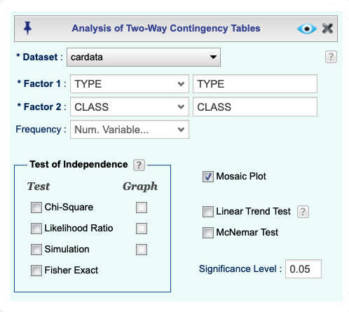
(#fig:mosaic_GUI)Contingency table dialog to create Mosaic Plot

Figure 9.11: An example of a mosaic plot output.