10 Plots for Numerical Data
This section gives Rguroo instructions for plots that display numerical data, including plots of numerical variables by categorical variables. All plots in Rguroo are highly customizable. In addition to the options in the ![]() dialog, you can customize your plots using the options in the
dialog, you can customize your plots using the options in the ![]() dialog.
dialog.
![]()
![]()
![]()
- Use a dataset in your Rguroo account or recreate the example below by importing the cardata dataset from the Rguroo dataset repository called Rguroo Users Guide into your account.
Click here to see a portion of the dataset.
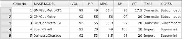
Open the Plots toolbox on the left-hand side of the Rguroo window. Click on the
Create Plotdropdown menu and choose the Barplot function. TheBarplotdialog will open (see Figure 10.1.Select your dataset from the Dataset dropdown menu. In this example, we select the cardata.
To create a barplot for numerical data, click on the
Numericaltab.Move one or more numerical variables to the
Selectedcolumn. We selected the variable HP.(Optional) Use the Factor 1 dropdown to select a categorical variable to compare the numerical variable between the levels of the selected variable.
(Optional) Select Conf. Bar to add confidence bars or Value Labels to add value labels to the bars.
From the Function dropdown, select a function to be applied to the selected numerical variable(s). The default function is Mean, which computes mean of the selected variable(s).
Click the Preview icon
 to see the barplot.
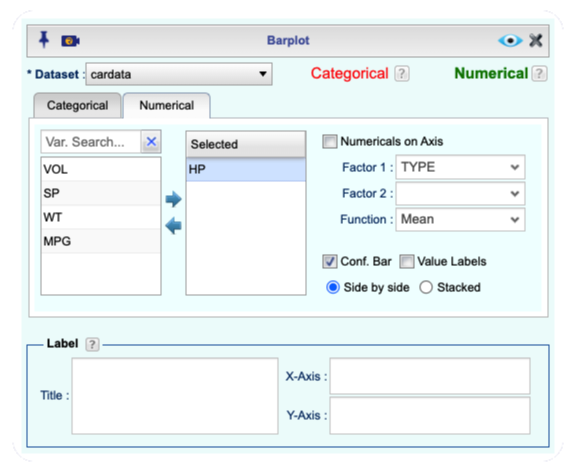
Figure 10.1: Barplot dialog for numerical variables.

Figure 10.2: An example of a Barplot for a numerical variable.
Additional options:
You can add confidence bars to the barplot by selecting the Conf. Bar checkbox.
You can add value labels to the bars by selecting the Value Labels checkbox.
you have options of side-by-side and stacked barplot.
You can apply functions such as mean, median, sum, count, and proportion using the Function dropdown.
![]()
![]()
- Use a dataset in your Rguroo account or recreate the example below by importing the cardata dataset from the Rguroo dataset repository called Rguroo Users Guide into your account.
Click here to see a portion of the dataset.
Open the Plots toolbox on the left-hand side of the Rguroo window. Click on the
Create Plotdropdown menu and choose the Boxplot function. TheBoxplotdialog will open Figure 10.3.Select your dataset from the Dataset dropdown menu. In this example, we select the cardata.
Move one or more numerical variables to the
Selectedcolumn.(Optional) Move one or more factor variables to the
Selectedcolumn.Click the Preview icon
to see the graph.
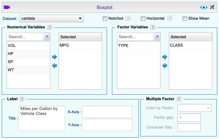
Figure 10.3: Boxplot dialog.

Figure 10.4: An example of a Boxplot.
Additional Boxplot options: - You can display the mean on boxplots by selecting the Show Mean checkbox.
You can draw horizontal boxplots by selecting the Horizontal checkbox.
You can use the Level Editor
 to reorder the boxplots by reordering the levels of the selected categorical variables.
You can identify outliers by clicking on the
 button, and selecting the
 Outliertab in the first section of the Graphs Settings dialog.
![]()
- Use a dataset in your Rguroo account or recreate the example below by importing the cardata dataset from the Rguroo dataset repository called Rguroo Users Guide into your account.
Click here to see a portion of the dataset.
Open the Plots toolbox on the left-hand side of the Rguroo window. Click on the
Create Plotdropdown menu and choose the Bubbleplot function. TheBubbleplotdialog will open (see Figure 10.5.Select your dataset from the Dataset dropdown menu. In this example, we select the cardata.
Select a Predictor (x) variable, a Response (y) variable, and a Bubble Size variable from the dropdowns.
Click the Preview icon
to view the graph.
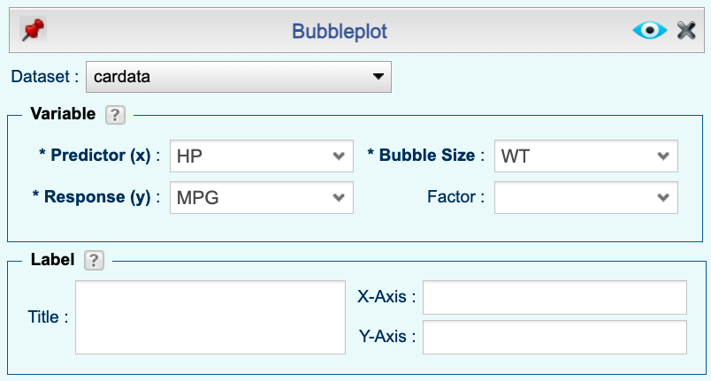
Figure 10.5: Bubbleplot dialog.

Figure 10.6: An example of a Bubbleplot.
![]()
![]()
- Use a dataset in your Rguroo account or recreate the example below by importing the Titanic dataset from the Rguroo dataset repository called R Datasets into your account.
Click here to see a portion of the dataset.
Open the Plots toolbox on the left-hand side of the Rguroo window. Click on the
Create Plotdropdown menu and choose the Dotplot function. TheDotplotdialog will open (see Figure 10.7.Select your dataset from the Dataset dropdown menu. In this example, we select the Titanic dataset.
Select a variable from the Numerical Variables section and move it to the
Selectedcolumn.(Optional) Select a variable from the Factor Variables section and move it to the
Selectedcolumn.Click the Preview icon
view the graph.
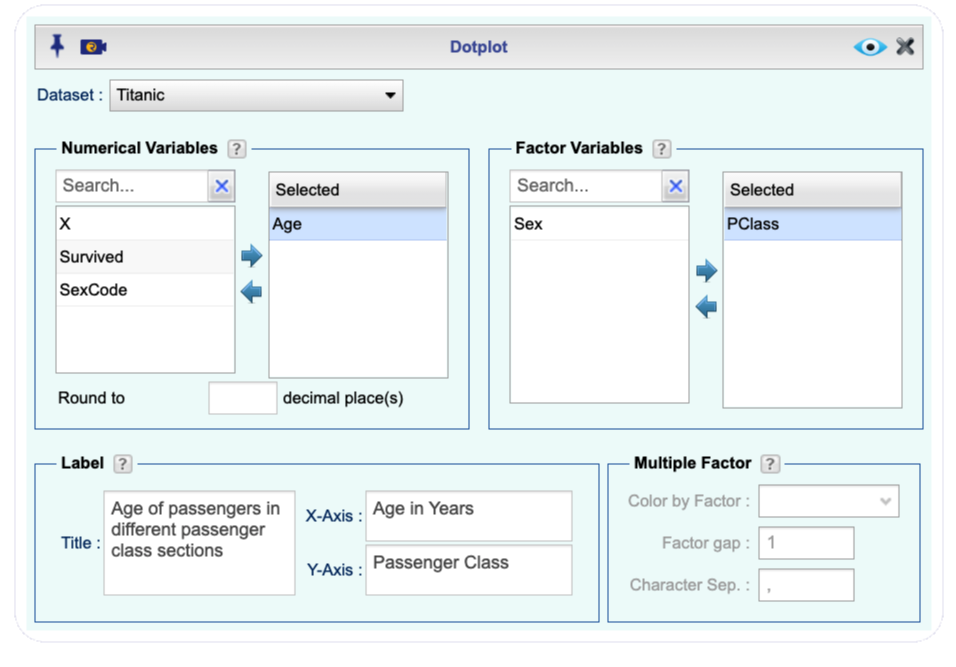
Figure 10.7: Dotplot dialog.
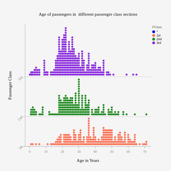
(#fig:DotplotExample_Output2)An example of a Dotplot.
![]()
![]()
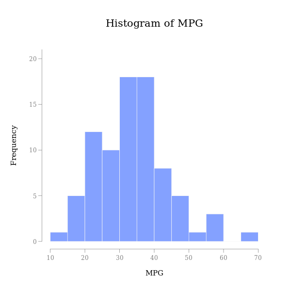
- Use a dataset in your Rguroo account or recreate the example below by importing the cardata dataset from the Rguroo dataset repository called Rguroo Users Guide into your account.
Click here to see a portion of the dataset.
Open the Plots toolbox on the left-hand side of the Rguroo window. Click on the
Create Plotdropdown menu and choose the Histogram function. The Histogram dialog will open (see Figure 10.8.Select your dataset from the Dataset dropdown menu. In this example, we select the cardata.
Select a Variable from the dropdown menu. Adjust the other options appropriately.
Click the Preview icon
to view the graph.
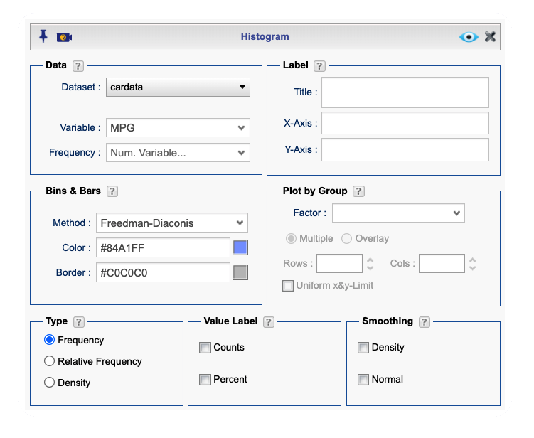
Figure 10.8: Histogram dialog.
An example of a Histogram Created by Rguroo
Additional Histogram options:
You can customize the bin breakpoints (classes) both in the Basics dialog and in the Details dialog. Click the
, open the Bins, Bars, Smoothingsection, and under theBins & Barssection select a method for Bin Breakpoints. Click the help icon to see descriptions of various methods.
Using the Endpoint dropdown, you can specify whether Rguroo should include data points that fall on the boundary of an interval in the right endpoint or the left endpoint when tabulating data. This option determines how values that match the interval’s endpoint are classified, ensuring consistency in data grouping.
You can create separate histograms for each level of a categorical variable by selecting the desired categorical variable from the Factor dropdown. This allows Rguroo to group the data based on the selected category and generate individual histograms for each level, making it easy to compare distributions across different categories.
You can customize how data is represented in a histogram by selecting one of the available options: Frequency, Relative Frequency, or Density. Choosing Frequency displays the count of observations within each bin, while Relative Frequency scales the bars to show the proportion of total observations in each bin. The Density option adjusts the histogram so that the total area sums to one, making it useful for comparing distributions with different sample sizes.
You can enhance the visualization of your histogram by superimposing additional elements such as value labels, a density curve, and a normal curve. Adding value labels displays the frequency or relative frequency of each bar. The density curve provides a smooth estimate of the data distribution, helping to identify patterns that may not be evident from the histogram alone. The normal curve overlays a normal distribution with mean and variance equal to that os sample mean and sample variance, allowing you to visually compare your data to a theoretical normal distribution.
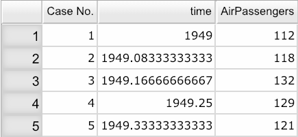
- Use a dataset in your Rguroo account or recreate the example below by importing the AirPassengers dataset from the Rguroo dataset repository called R Datasets into your account.
Click here to see a portion of the dataset.
Open the Plots toolbox on the left-hand side of the Rguroo window. Click on the
Create Plotdropdown menu and choose the Scatterplot function. The Scatterplot dialog will open (see Figure 10.9.Select your dataset from the Dataset dropdown menu. In this example, we select the AirPassengers dataset.
Select a Predictor (x) variable and a Response (y) variable from the dropdowns. Adjust the other options appropriately.
In the Superimpose section, select the option Line Graph.
Click the Preview icon
to view the graph.
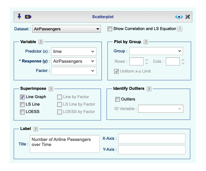
Figure 10.9: Line Graph dialog.
An example of a Line Graph Created by Rguroo

- Use a dataset in your Rguroo account or recreate the example below by importing the cardata dataset from the Rguroo dataset repository called Rguroo Users Guide into your account.
Click here to see a portion of the dataset.
Open the Analytics toolbox on the left-hand side of the Rguroo window. Click on the
Analysisdropdown menu and choose the Mean Inference —> One Population function. TheMean Inferencedialog will open (see Figure 10.10).Select your dataset from the Dataset dropdown menu. In this example, we select the cardata.
Select a Variable from the dropdown.
Select the Normal Probability Plot checkbox.
Click the Preview icon
to view the graph.
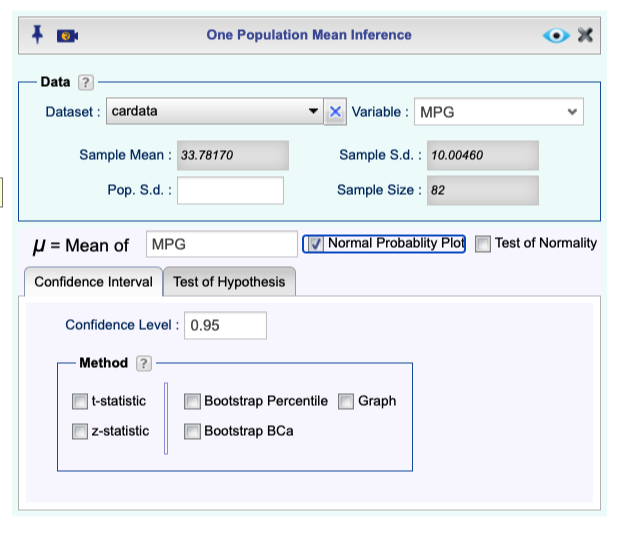
Figure 10.10: Normal Probability Plot dialog.

Figure 10.11: An example of a Normal Probability Plot.
10.8 Scatterplot
![]()
![]()
- Use a dataset in your Rguroo account or recreate the example below by importing the cardata dataset from the Rguroo dataset repository called Rguroo Users Guide into your account.
Click here to see a portion of the dataset.
Open the Plots toolbox on the left-hand side of the Rguroo window. Click on the
Create Plotdropdown menu and choose the Scatterplot function. TheScatterplotdialog will open (see Figure 10.12.Select your dataset from the Dataset dropdown menu. In this example, we select the cardata dataset.
Select a Predictor (x) variable and a Response (y) variable from the dropdowns.
(Optional) Select a categorical variable from the Factor dropdown.
(Optional) You can identify outliers, using an ID Variable by selecting the Outliers checkbox.
Click the Preview icon
to view the graph.
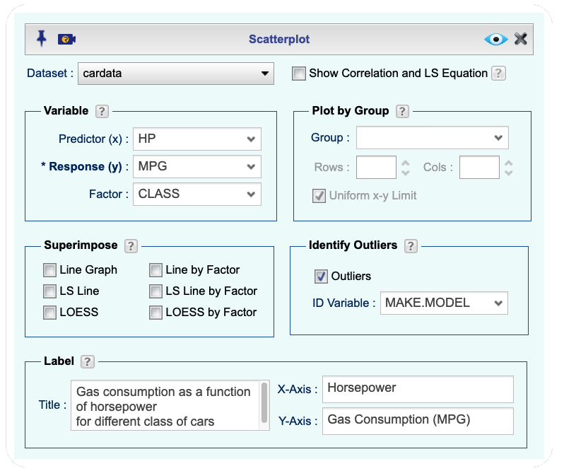
Figure 10.12: Scatterplot dialog.
An example of a Scatterplot Created by Rguroo

![]()
- Use a dataset in your Rguroo account or recreate the example below by importing the cardata dataset from the Rguroo dataset repository called Rguroo Users Guide into your account.
Click here to see a portion of the dataset.
Open the Plots toolbox on the left-hand side of the Rguroo window. Click on the
Create Plotdropdown menu and choose the Stem and Leaf function. TheStem and Leafdialog will open Figure 10.13.Select your dataset from the Dataset dropdown menu. In this example, we select the cardata.
Select a Variable from the dropdown.
(optional) In the Scale section, type a value in the Scale textbox. The default scale is 1.
Click the Preview icon
to view the graph.
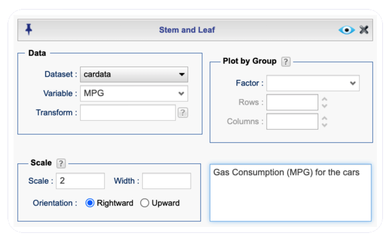
Figure 10.13: Stem and Leaf dialog.
An example of a Stem and Leaf Plot Created by Rguroo

Figure 10.14: An example of a Stem and Leaf Plot.
- Use a dataset in your Rguroo account or recreate the example below by importing the AirPassengers dataset from the Rguroo dataset repository called R Datasets into your account.
Click here to see a portion of the dataset.
Open the Analytics toolbox on the left-hand side of the Rguroo window. Click on the
Analysisdropdown menu and choose the Time Series function. TheTime Seriesdialog will open Figure 10.15.Select your dataset from the Dataset dropdown menu. In this example, we select the AirPassengers dataset.
From the Numerical Variables section, select and drag the variable AirPassengers to the
Selectedcolumn.(Optional) Under the Time Specification section, from the Type dropdown, select the time frequency of your data (yearly, quarterly, monthly, daily, hourly, by minute, or seconds). The AirPassengers data are monthly, so we select Month from the Type dropdown menu. Then set an appropriate start month and year for the data. The AirPassengers data starts from January 1949, so set
Yearto \(\tt{1949}\) andMonthto \(\tt{1}\).In the section Time Series Plot, select the Lines checkbox and optionally the Points checkbox.
Click the Preview icon
to view the graph.
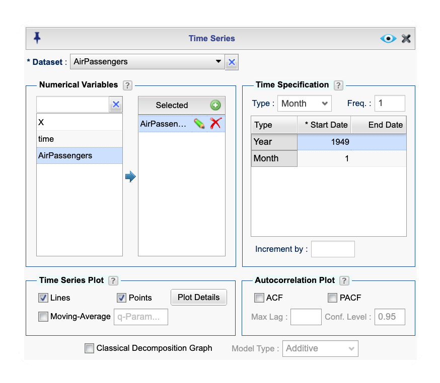
Figure 10.15: Time Series dialog.
An example of a Time Series Plot Created by Rguroo

Figure 10.16: An example of a Time Series Plot.